With 2015 coming to a close, this year for web design has been anything but dull. Innovation is never lacking, and creativity is forever flowing through the power of the web and as designers we are always coming up with new ideas. Websites have become more and more interactive and engaging audiences of all ages, whilst staying simple enough for anyone to navigate hassle free. Here are a few of the many trends that happened in 2015.
Colors
Have you noticed some of your favorite websites, especially news websites, are taking a step away from the typical black and white layout and into something more bold, colorful and dynamic? This year color was defiantly a trend being used more as a statement instead of just background decoration. Background images, still being a big part of modern design, are beginning to fadeaway and big colorful banners, headers, navigations, etc. are coming into play.
Take a look at Bloomberg as an example
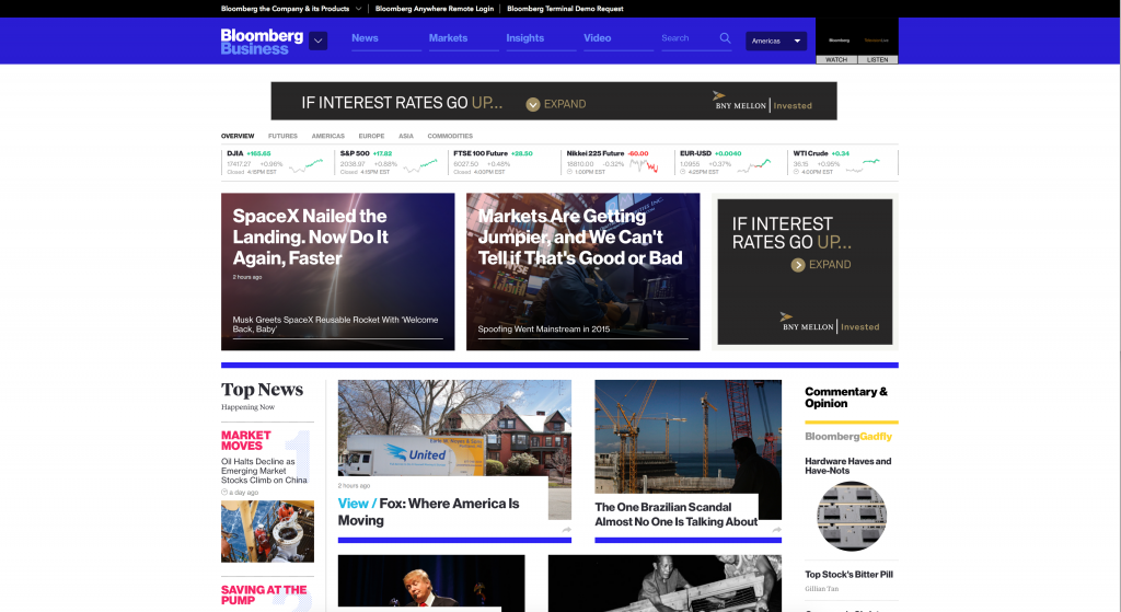
They walked away from their previous black and white, repetitive styling and into a colorful, vibrant, aggressive color pallet. These changes help set them apart from their competition, such as The Huffington Post, by creating a dynamic and memorable experience for their users.
Favoring Simplicity
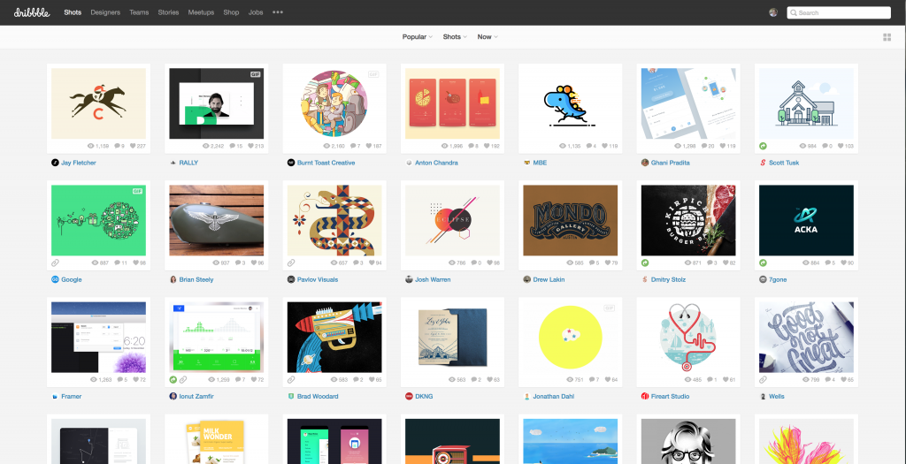
Simplicity is key is something you hear a lot, and believe it or not it is a very true statement. Less can be more, it can become more memorable, more creative, more intuitive and so much more by taking the time to figure out what is needed and what isn’t. With 2015, websites began to adopt this stylization known as flat design and/or minimalism. Flat design has been around since late 2013 as a stylization derived from Swiss style, also known as the International Typographic Style, but if you take sites, such as Dribbble, you will notice a lack of imagery, except for their content, and more broader use of distinctive white space. The whole idea behind these design styles is simply simplicity.
Motion
With HTML5 and CSS3 recently being released in late 2014, designers and developers took advantage of their new found abilities they had been given access too and ran with it. Motion is a big part of the web now. Everything you look at usually has some kind of transition or animation attached to it in order to catch the users attention and have them play around with different elements of the website. Animations are also used to portray information, such as when you send a message and then an animated box appears before you telling you that the message has been sent. It’s that kind of flair that users appreciate.
Some developers don’t know their limitations and add too much animation. Taking animation way too far and having what could have been an awesome website looking more like a disney film due to everything being animated. Too much animation can ruin a good website, so please use it wisely.
“With great power comes great responsibility” – Uncle Ben
Scrolling
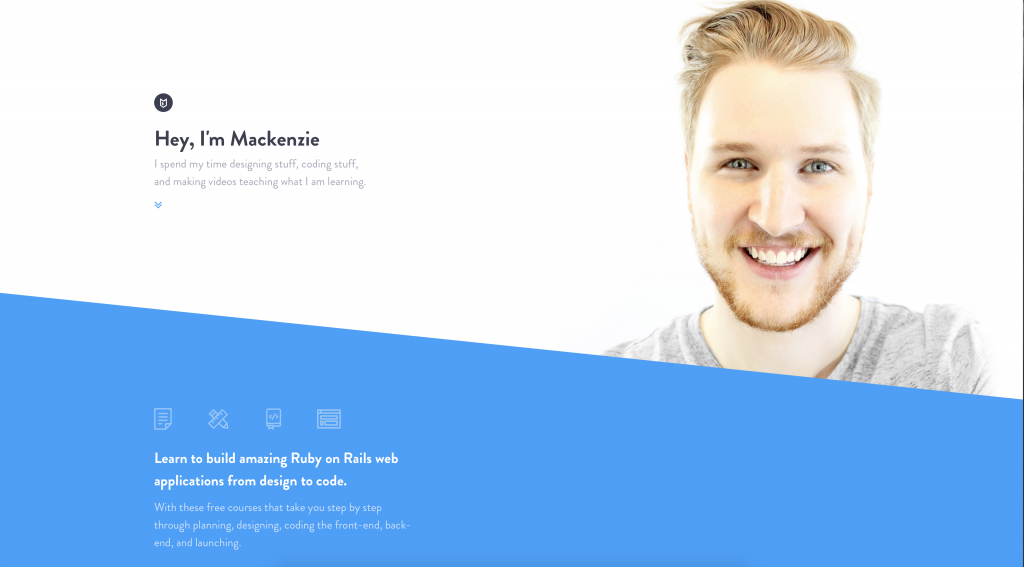
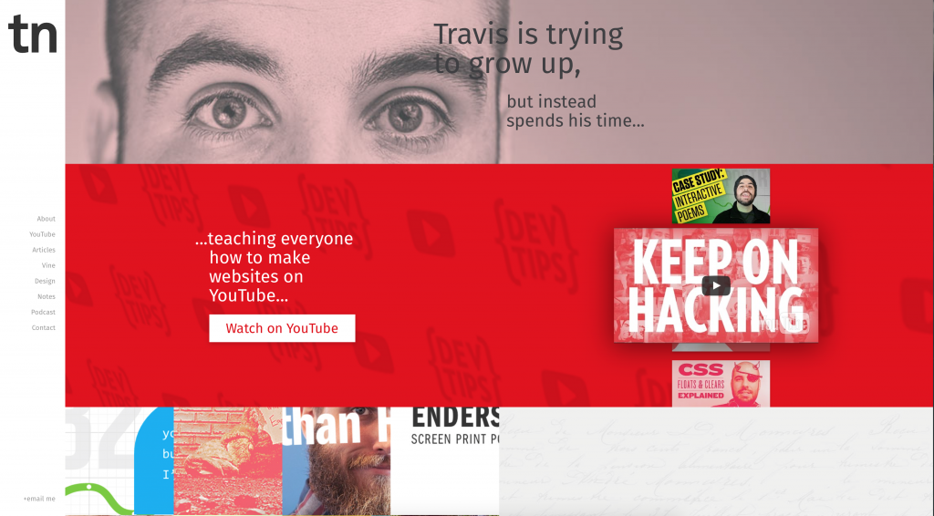
Lastly, but certainly not least, is scrolling websites. I know you’ve seen them somewhere before. Websites such as Mackenzie Child’s or Travis Neilson’s online portfolio’s portray most of the standard scrolling websites features.
The reason scrolling websites are so great and so many developers are pitching the idea to potential clients is because:
- They can be engaging by telling a story
- Take something that would take multiple pages for a user to navigate through and wrapping it all up into 1 page
- Users area already used to scrolling because of their mobile devices and social media websites such as Facebook or Twitter.
Conclusion
2015 has been an eventful year, but I can already see that this isn’t even the tip of the iceberg. Creativity will keep on growing and next year will make what was cool now ancient history in under a years time.